CSS横向滚动,一个居中,多个靠左
总字数658
阅读时长 ≈2 分钟
CSS横向滚动,一个居中,多个靠左
刚好有个需求需要用到,做个笔记。
当孩子box个数比较少的时候,把盒子居中,多个盒子并排超过一行的时候,盒子左对齐排列并且出现横向滚动条。
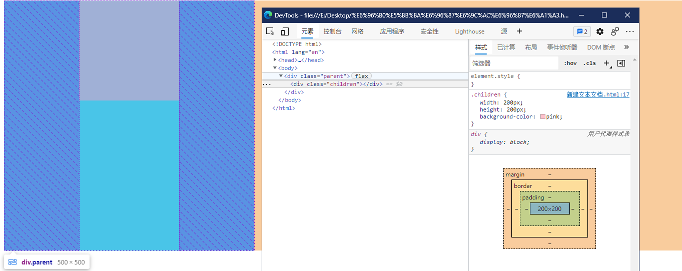
这个需求使用flex布局来做,在flex布局中,使用它的属性justify-content: center可以让盒子在横轴上居中。
代码如下:
html
<div class="parent">
  <div class="children"></div>
</div>
css
.parent {
  width: 500px;
  height: 500px;
  display: flex;
  justify-content: center;
  background-color: aqua;
}

.children {
  width: 200px;
  height: 200px;
  background-color: pink;
}
效果:
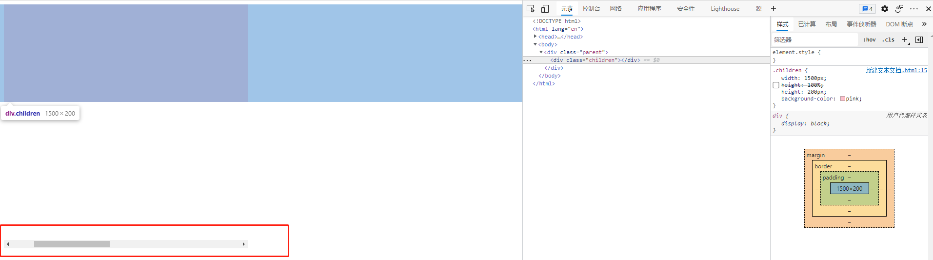
使用overflow-x: auto来制作横向滚动条。
代码如下:
html
<div class="parent">
  <div class="children"></div>
</div>
css
.parent {
  width: 500px;
  height: 500px;
  overflow-x: auto;
}

.children {
  width: 1500px;
  height: 500px;
  background-color: pink;
}
效果如下:
结合这两个属性,我们的思路就很明确了。
即使用两个flex盒子来实现这一个效果。
- 外层
flex盒子的作用是起到孩子少个的时候居中。 - 内层
flex盒子的作用是起到孩子多个的时候左对齐,并出现滚动条。
代码如下:
html
<div class="p1">
  <div class="p2">
    <div class="child"></div>
  </div>
</div>
<div style="text-align: center">
  <button id="add">加一个</button>
  <button id="remove">减一个</button>
</div>
css
.p1 {
  width: 50%;
  margin: 100px auto;
  display: flex;
  justify-content: center;
  border: 1px solid black;
}

.p2 {
  display: flex;
  overflow-x: auto;
}

.child {
  width: 200px;
  height: 200px;
  margin: 0 20px;
  flex-shrink: 0;
  background-color: pink;
}
javascript
add.onclick = function () {
  const el = document.createElement("div");
  el.className = "child";
  document.getElementsByClassName("p2")[0].appendChild(el);
};

remove.onclick = function () {
  const list = document.getElementsByClassName("child");
  document.getElementsByClassName("p2")[0].removeChild(list[list.length - 1]);
};
效果如下:
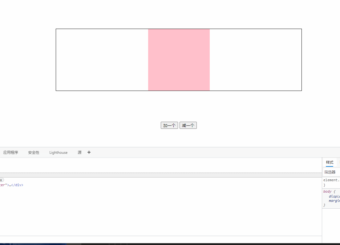
可以看到当图片只有一张的时候,在父元素盒子里面居中,当孩子多的时候,出现滚动条并且左对齐。
能不能只使用一个flex盒子完成这个设计呢,我测了一下发现不行。
如果使用一个flex盒子,那么我们的html结构变为如下:
html
  <div class="p2">
    <div class="child"></div>
  </div>
</div>
<div style="text-align: center">
  <button id="add">加一个</button>
  <button id="remove">减一个</button>
</div>
样式方面即我们把原来分散到两个盒子的样式混合到一个盒子里面:
css
.p2 {
  width: 50%;
  margin: 100px auto;
  display: flex;
  overflow-x: auto;
  justify-content: center;
  border: 1px solid black;
}

.child {
  width: 200px;
  height: 200px;
  margin: 0 20px;
  flex-shrink: 0;
  background-color: pink;
}
那么我们可以得到如下的效果图:
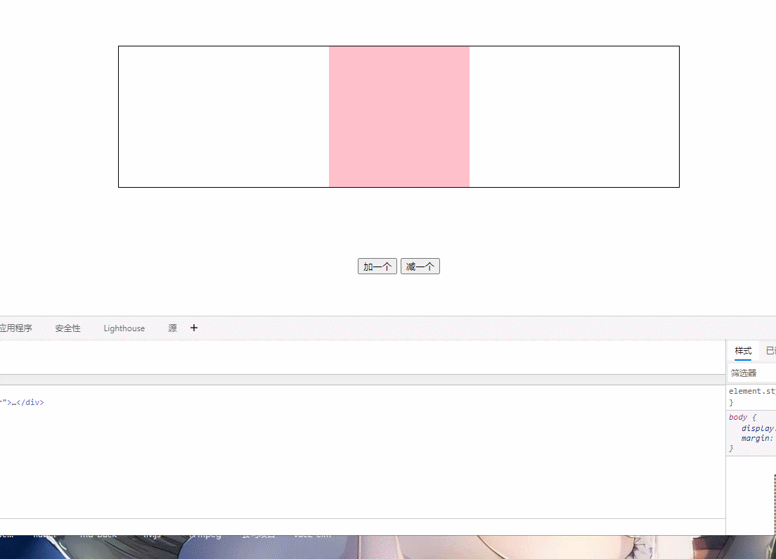
当一个的时候看起来没有什么问题,符合需求。
但是当多个的时候,由于受到justify-content: center;使得滚动条的位置出现了错误,左侧盒子有些被隐藏了。
哦呐该,如果没有评论的话,瓦达西...